The CSS grid layout offers a system of rows and columns, making it easier to design web pages without having to use relative or absolute positioning.
Grid properties are supported in all modern browsers.
A grid layout consists of a parent element with one or more child elements.
Example:
<div class="grid-example">
<div class="grid-item">1</div>
<div class="grid-item">2</div>
<div class="grid-item">3</div
</div>
An HTML element becomes a grid container when its display property is set to grid or inline-grid.
Example:
.grid-example {
display: grid;
}
The vertical lines of grid items are called "columns." The horizontal lines of grid items are called "rows."
The space between the items is called the "gap." There are vertical "column gaps" between the columns and horizontal "row gaps" between the rows.
The grid-column-gap property sets the gap between columns. Example:
.grid-example {
display: grid;
grid-column-gap: 20px;
}
The grid-row-gap property sets the gap between rows. Example:
.grid-example {
display: grid;
grid-row-gap: 20px;
}
The grid-gap property can be used with two values to set both the row gap and the column gap, or it can be used to set both the row and column gap to a single value. Example:
.grid-example {
display: grid;
grid-gap: 20px 50px;
}
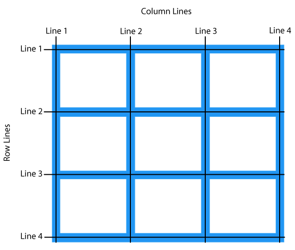
The lines between columns are called "column lines." The lines between rows are called "row lines"
The grid-template-columns property defines the number of columns in the grid, and it can define the width of each column. The value is a space separated list, where each value designates the width of the respective column.
Example - A grid with four columns:
.grid-example {
display: grid;
grid-template-columns: 100px auto 50px auto;
}
The grid-template-rows property defines the number and height of rows in the grid, similarly to grid-template-columns .
Example - A grid with three rows:
.grid-example {
display: grid;
grid-template-rows: 20px 25px auto;
}
The justify-content property is used to align the content horizontally. Allowed property values are:
flex-start: default value. items positioned to the leftflex-end: items positioned to the rightcenter: items positioned in the centerspace-between: items will have space between themspace-around: items will have space before, between, and afterspace-evenly: items will have equal space around theminitial: sets property to default valueinherit: inherits this property from its parent
The align-content property is used to align the content vertically. Allowed property values are:
stretch: default value. items are stretched to fitcenter: items positioned in the centerflex-start: items positioned at the topflex-end: items positioned at the bottombaseline: items positioned at the baselineinitial: sets property to default valueinherit: inherits this property from its parent